I've been with a peach and apricot colour palette for the Berry71Bleu colour challenge for July.
It's one of those colours that makes me cringe and think of 80's taffeta formal dresses (LOL). Maybe not the best colour for fashion, but on a scrapbooking page it's gorgeous.
Peach/apricot tones are wonderful for bringing the focus onto people in the photos, because of the skin tones. It's also a great trick to use when scrapping pics of groups of people who are all wearing different colours.
Anyway here's a couple of layouts I did...
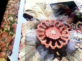
I used Graphic 45 papers and a few Martha Stewart punches. An idea is to use small strips of paper with decorative punches, and layer to create interest.
My "flower" is used by punching both sides of the paper with Martha's Daisy Fan punch.
Using up some more scraps ...... I scraped paint onto my cardstock using a piece of plastic, and tucked my journalling into a hidden pocket. The gorgeous tag is by Marivic at Berry71Bleu. (I can't take credit for it, unfortunately)


These look great Tina. I love those flowers all grouped together - and the cakestand!
ReplyDeleteLowri :-)
Yummy colours. That paper range is probably the most popular one this year!
ReplyDelete