Thought I would share a couple of super easy tips for making your photos look better in 10 seconds flat!
There are a few free photo editing packages on the Internet - but I use the Google one called Picasa - downloadable from here - http://picasa.google.com/
It is easy to use and with literally two "auto-correct" options you can really make your pics look so much better. The key to success is cropping your pictures to focus on the subject matter and auto-tuning.
The auto-colour and the auto-contrast buttons are often all you need to use - though there are many other fine tuning functions available too. Here is what I mean!
(NOTE: Depending on your screen these might look very different or not that different! I could barely see the difference on my laptop - but on a PC they were very obvious)
1) LOVE Album
This was an OK picture to begin with but just look at the difference when you crop and use the auto-adjust buttons!
2) Crayons
Again - this was an OK photo to begin with, but all I have done here is use the auto-contrast and auto-colour options. Because it was taken outside, the brightness of the colours really shines through
You probably know that natural light is the best light for photographing but sometimes in winter - even here in sunny Marlborough it's hard to take good pictures as the winter light is very blue and dark compared to bright yellow summer light. Try a few spots around your garden and you can always use a piece of white paper as a background - then no-one will know you took it outside. I usually just find a good spot with a neutral background as it's quicker...
3) Cosmo Cricket Album
Another photo taken outside (this time in winter - you can see how "blue" the light is and this was taken in the middle of the day!) and again - a huge difference with 2 simple adjustments
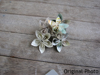
4) Map Flowers
It was so hard to get decent photos of these. We had three overcast days in a row and in the end I just did the best I could. Still - the cropping and auto options made a difference. I also increased the saturation (on the Effects tab in Picasa) to make the colors a little brighter
Since I have been looking at craft blogs I have seen so many with fabulous projects - but they look dull because of poor photography.
All it takes is a little bit of practice and these basic tips.
I should add that since I started on the Design Team I have picked up ALL these tips from others - so hopefully I can now pass them on!
Please leave a comment if you have any questions - and remember - if you are applying for the Design Team (see all the details HERE) then good photographs will greatly improve your chances :-)
Splendid post Lowri. Thanks heaps. I use Picasa all the time too. Makes great collages with the click of a button. Looking forward to looking at all the Design Team entries as they start to roll in. Exciting times!
This was an excellent idea to post about. There are heaps of free tutorials on the web - a few adjustments make a big difference. My two top tips would be as yours: check your background and crop as much as possible!


Splendid post Lowri. Thanks heaps. I use Picasa all the time too. Makes great collages with the click of a button. Looking forward to looking at all the Design Team entries as they start to roll in. Exciting times!
ReplyDeleteGreat tips Lowri. It certainly makes a big difference and helps to show how the project looks in real life.
ReplyDeleteThis was an excellent idea to post about. There are heaps of free tutorials on the web - a few adjustments make a big difference. My two top tips would be as yours: check your background and crop as much as possible!
ReplyDeleteSome lovely photo editing tips. This may also help everyone. Thanks
ReplyDeletephotography & Photo editing tips
Thank you. This is helpful for me because I love photography and Photo Editing
ReplyDelete