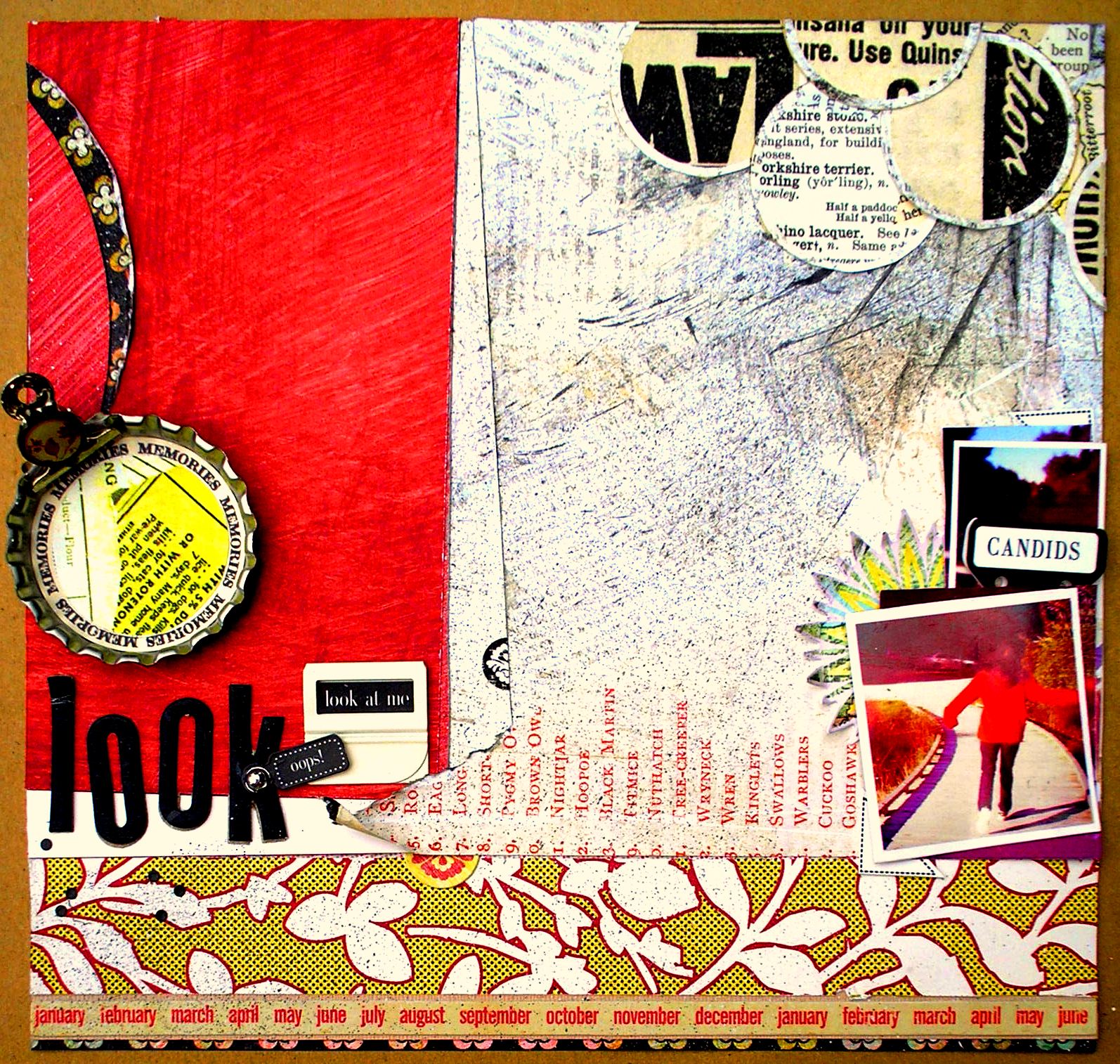
Hi everyone, it's Sandy posting a layout inspired by the edginess of Basic Grey's Out of Print papers.
Let me share with you how I play with photos. This is the original shot - backview of the figure, curving path, murky background of trees and sky.
I flipped the photo horizontally so that I can position the it on right with the path leading into the center of the layout. Cropped tightly on the figure for my main pic and cropped on the sky between the trees for my secondary pic. Then I just layered two secondary pics behind two main pics with some stickers to embellish.
Now I indulged in some messy fun. Both the red and white papers came pre-patterned with textured brush strokes. I took it up a notch by splattering some black ink (by flicking a toothbrush on the page) and scratching on some paint lines (with the edge of an old credit card). A bunch of newsprint circles anchored the top end of my layout. Another circle in an oversized bottle cap completed the design triangle.
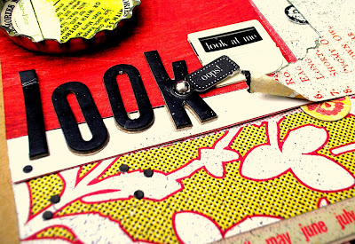
Thanks for looking at this Look layout where I did grunge with a classic twist.
Supplies : Basic Grey Out of Print (Second Edition, Daily News, Headline, Sticker), 7gypsies (Reef Sand, Photographie stickers, metal index tabs), Heidi Swap Jet alphas, Hero Arts gem, Crate Paper Portrait border sticker, Bottle Cap Inc standard chrome, Making Memories brad, Studio g black ink, metal clip
Sweet! Love the way you've brought out the reds, black and yellow. To some it looks like a pink range (another one!!!). Not that I mind pink... Great work and thanks for the idea about flipping a photo to make it work better. Must file that one away...


Sweet! Love the way you've brought out the reds, black and yellow. To some it looks like a pink range (another one!!!). Not that I mind pink... Great work and thanks for the idea about flipping a photo to make it work better. Must file that one away...
ReplyDeleteI love seeing edgy ways to use paper. The colour palette is great!!
ReplyDeleteLove going the grunge very brave! Great tip re flipping the photo...I have lots of photos I could do that with :)
ReplyDeleteThis looks fantastic Sandy! I love the way the colours pop - and even though it is a little grungy - it's distinctively your style.
ReplyDeleteAwesome job!
This was incredibly an exquisite implementation of your ideas. Sticker company Dublin Ireland
ReplyDelete